
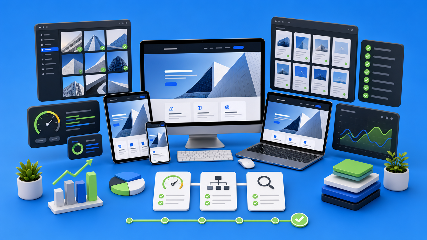
Webflow performance is not a last-minute technical cleanup. For design-led websites, performance is a production discipline that starts with image strategy, responsive QA, CMS structure, interaction choices, semantic HTML, and a clear handoff model. The goal is not to make the site visually simpler. The goal is to make the design load quickly, behave predictably, and stay maintainable after launch.
Design-led teams usually notice performance problems late: a hero image feels heavy on mobile, an animation looks premium on desktop but stutters on a laptop, CMS pages load unevenly, or a beautiful section becomes hard to edit without breaking the layout. By that point, the site may already be close to launch, which turns performance into a stressful rescue task.
A better approach is to treat performance as part of Webflow production from the beginning. The build should preserve design intent while controlling the things that quietly make websites slower: oversized media, unstructured classes, unnecessary scripts, weak responsive rules, CMS templates that do too much, and missing SEO basics.
Why performance matters more for design-led websites
Minimal websites can feel fast by default because they carry less visual complexity. Design-led websites have a harder job. They often include editorial hero sections, rich imagery, layered layouts, motion, CMS-driven collections, case study templates, and detailed responsive behavior. None of that is wrong. In fact, those details are often what make the brand feel premium.
The problem appears when the production layer does not protect the design. A beautiful website can still feel poor if the first load is slow, mobile sections jump, images blur or crop badly, interactions delay the page, or editors cannot update content without asking a developer.
For devthinX, performance means the site reaches a practical balance between visual ambition and operational stability. A strong Webflow build should look considered, load cleanly, remain editable, and give the marketing team confidence after handoff.

The performance checklist at a glance
Before going deep, here is the high-level checklist we use when reviewing a design-led Webflow build. It is intentionally practical. Each line is something that can be checked before launch, not a vague best practice.
Performance matrix
Production areaWhat to checkWhy it mattersImages and mediaFile size, dimensions, format, alt text, decorative vs meaningful mediaLarge assets are usually the fastest way to slow down a Webflow site.Responsive layoutsTablet, mobile landscape, mobile portrait, long content, card wrappingPerformance includes layout stability and perceived polish on real screens.InteractionsAnimation purpose, trigger count, scroll effects, reduced complexity on mobileMotion should improve hierarchy, not compete with loading and usability.CMS templatesField structure, optional sections, image behavior, related content logicCMS pages often become heavy when templates are too flexible without rules.SEO foundationTitles, meta descriptions, heading hierarchy, internal links, slugsTechnical SEO should be built into the production system, not patched later.HandoffClass naming, editor guidance, reusable components, QA notesA fast launch is not enough if the site becomes fragile after publishing.
1. Start with a performance budget before development
A performance budget is a simple set of limits that keeps production decisions honest. It does not need to be bureaucratic. For most Webflow marketing sites, the team should agree on rough expectations for hero image weight, total page media, third-party scripts, animation complexity, and mobile behavior.
This is especially helpful when the design uses large visuals. Instead of asking whether an image looks good only inside Figma, ask what it will cost in production. Does it need to be full-bleed on every breakpoint? Can mobile use a tighter crop? Does the image communicate something meaningful, or is it purely atmospheric? Can the same visual direction be preserved with a lighter asset?
Performance budgets make trade-offs visible before the build becomes too far along.
Asset sizing matrix
Asset typeRecommended production targetNotesBlog cover image1600 x 900 or 1920 x 1080, compressed for webUse 16:9 so the same asset works for cards, hero areas, and social crops.Hero imageLarge enough for retina screens, but not uploaded at raw design-export sizeUse responsive variants and avoid uploading massive source files.Inline article image1200-1600 px wide, compressedKeep captions useful and alt text descriptive.Decorative textureSmall and reusableIf it does not explain anything, keep it light or build it in CSS.VideoEmbed only when it supports the articleAvoid autoplay and heavy embeds above the fold.
2. Treat images as design assets and performance assets
Images are not just visual decoration. They are production assets. A Webflow site can have excellent typography, clean spacing, and refined motion, but if the image system is uncontrolled, the site will feel heavy.
The first step is simple: every meaningful image should have a job. If it explains a concept, supports trust, shows work, or gives the page editorial depth, it deserves space. If it only fills a gap, it should be questioned.
Then optimize the file itself. Export at the right dimensions, compress before launch, use descriptive alt text for meaningful images, and keep decorative assets marked appropriately. When multiple cards reuse a visual style, build a repeatable approach instead of uploading unrelated large images for each entry.
Image QA questions
- Is this image needed for understanding, trust, or conversion?
- Is the uploaded file close to the actual rendered size?
- Does mobile need the same crop as desktop?
- Does the image have useful alt text if it carries meaning?
- Could a CSS treatment replace a heavy decorative asset?
3. Build responsive behavior as a system, not as fixes
Responsive QA is where many design-led builds reveal their quality. It is not enough for the desktop layout to match the Figma file. A professional Webflow build defines how each section behaves when the viewport changes, when content gets longer, and when editors add real CMS entries.
Common issues include cards becoming uneven, buttons wrapping awkwardly, images losing the subject, sticky elements covering content, and typography feeling too large inside compact sections. These are not only visual problems. They affect perceived speed because users experience layout instability as friction.
Responsive decisions should be made section by section. A pricing grid, testimonial carousel, case study card, and blog hero will each need different rules. The job is not to shrink the desktop design. The job is to preserve hierarchy under new constraints.
4. Keep interactions intentional
Motion can make a Webflow site feel expensive. It can also make it feel slow. The difference is intention. A strong interaction supports attention: it reveals content, clarifies hierarchy, or gives the page a controlled rhythm. A weak interaction adds movement without improving comprehension.
For performance, avoid stacking too many scroll-triggered effects on the same page. Be especially careful with animations around large media, sticky sections, heavy blur effects, and repeated elements inside CMS lists. On mobile, simplify. A subtle fade or transform is often better than trying to preserve every desktop interaction.
Interaction matrix
Interaction patternGood useRiskFade and slide revealLight section entrance, editorial pacingOveruse makes every scroll feel delayed.ParallaxSmall depth effect on high-value sectionsCan become heavy or disorienting on mobile.Hover micro-interactionsCards, buttons, work previewsShould not hide essential information.Sticky sectionsExplaining multi-step frameworksNeeds careful mobile fallback and content-height testing.Looping motionRarely, for controlled brand momentsCan distract and increase resource use.
5. Design CMS templates for real content
CMS performance is not only about page speed. It is also about editorial speed. If a marketing team cannot publish confidently, the site is not truly production-ready.
For blog posts, case studies, services, and resource pages, the CMS should guide editors toward consistent output. That means clear required fields, helpful field descriptions, predictable image ratios, structured excerpts, SEO metadata, and optional fields that do not break the layout when empty.
A common mistake is making a CMS template too flexible. Flexibility sounds useful, but without rules it creates inconsistent pages. A better system gives editors enough control to publish, while keeping layout decisions inside components and templates.
CMS template checks
- Every required visual field has a clear recommended size and ratio.
- Every CMS listing card has a fallback state for missing optional data.
- Long titles and excerpts have been tested on mobile.
- Related posts or related work sections are filtered intentionally.
- Article pages include internal links to relevant services or case studies.
- SEO title and meta description fields are present before publishing.
6. Use tables and structured blocks when the article needs them
Long-form articles should not be a wall of paragraphs. Readers scan before they commit. Tables, comparison blocks, checklists, and short summaries make the page easier to understand and more useful for search.
The reference standard here is not length for its own sake. A strong article earns its length by giving the reader structure. For Webflow performance content, tables are especially useful because they turn abstract advice into production decisions.
For example, a client or agency does not only need to hear that images should be optimized. They need to know what should be checked, who owns it, and when it should happen.
Ownership matrix
StageOwnerPerformance responsibilityDesign approvalDesigner and production leadIdentify heavy sections, media risks, and responsive edge cases.Webflow buildDeveloperCreate clean structure, responsive behavior, optimized classes, and CMS logic.Content entryMarketing or content teamUpload right-sized images, complete metadata, and avoid layout-breaking copy.Pre-launch QAProduction leadTest speed, responsive layout, CMS templates, forms, SEO basics, and accessibility.Post-launchSite ownerMonitor edits, update content, and keep new assets consistent with the system.
7. Include the right kind of video
Video can improve an article when it supports the topic. It should not be added just to make the page look richer. For this article, the most relevant video is Webflow University's official performance tutorial, because it covers practical site-performance optimization inside the Webflow ecosystem.
If the embed feels too heavy for your template, keep it lower in the article rather than placing it above the fold. That gives readers context first and keeps the first load cleaner.
Watch the official Webflow University performance tutorial if you want a practical walkthrough from Webflow's own education team.
8. Do not separate SEO from performance
SEO and performance are often treated as separate tasks. In practice, they overlap. A page that loads slowly, has weak heading structure, missing image alt text, vague titles, or poor internal linking is not production-ready.
For every important Webflow page, check the basics before publishing: one clear H1, descriptive H2 structure, a unique SEO title, a focused meta description, human-readable slug, useful internal links, and images that support the article rather than slow it down.
For blog content, internal links matter. A performance article should naturally connect to services, related production notes, case studies, or a contact CTA. That turns the article from a standalone post into part of a search and conversion system.
9. Run QA like a production review, not a quick preview
Previewing a page once in Webflow is not QA. A production review checks the page under realistic conditions. Open the page at multiple breakpoints. Test long titles and long excerpts. Check CMS entries that are not perfect. Review images on a real phone. Click forms. Test links. Look for text wrapping inside buttons and cards.
Performance QA should also include ownership. If no one owns image compression, it will be skipped. If no one owns responsive QA, mobile issues will stay hidden. If no one owns SEO fields, pages will ship with defaults. A launch checklist only works when every line has a responsible person.
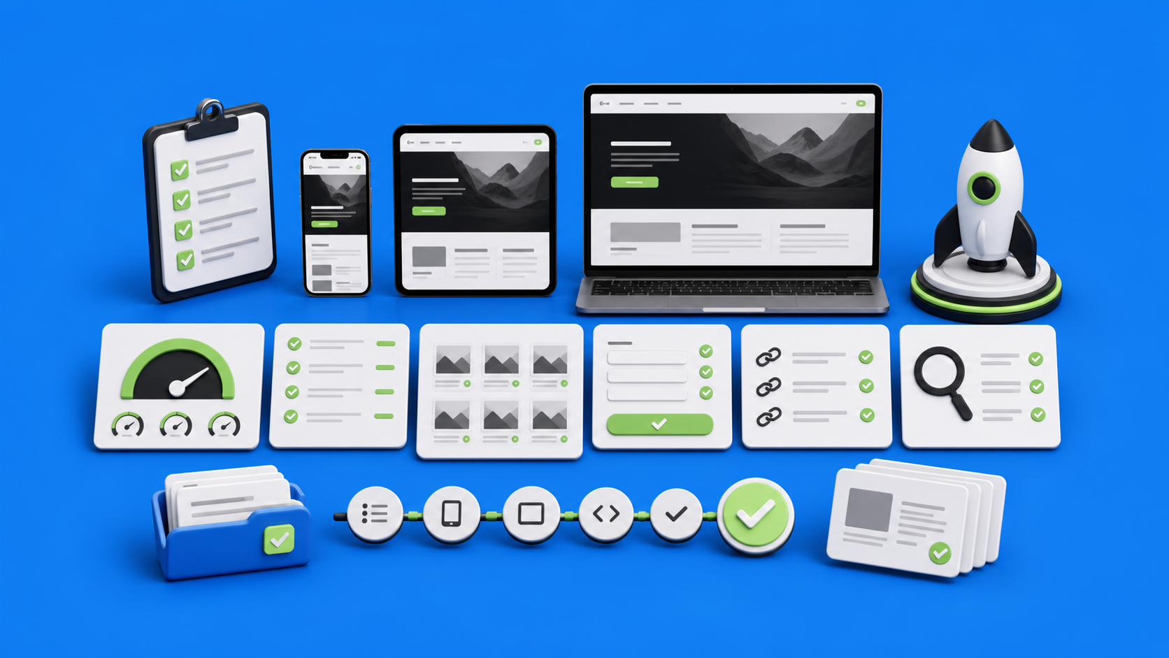
A practical pre-launch checklist
Use this as a compact final pass before publishing a Webflow marketing site or a major new CMS template.
Media
- Hero images are exported at the correct ratio and compressed.
- Blog and case study covers use consistent dimensions.
- Decorative images do not carry unnecessary alt text.
- Meaningful images have descriptive alt text.
- Videos are embedded only where they add value.
Responsive behavior
- Desktop, tablet, mobile landscape, and mobile portrait have been checked.
- Cards, buttons, and headings do not overflow.
- Sticky or animated sections have mobile fallbacks.
- Long CMS content has been tested.
- Images crop intentionally across breakpoints.
CMS
- Required fields are clear and useful.
- Optional fields have safe empty states.
- Listing cards remain balanced with real content.
- Article templates support images, captions, tables, and CTA blocks.
- Editors know what image sizes and formats to use.
SEO and structure
- Every page has a unique SEO title and meta description.
- Heading hierarchy is clean and human-readable.
- URLs are short and descriptive.
- Internal links point readers toward relevant services or next steps.
- Open Graph image and page preview are checked before sharing.
How devthinX approaches Webflow performance
At devthinX, performance is treated as part of the build logic, not as a plugin or a late optimization sprint. The goal is to preserve the design while making the system easier to load, edit, and extend.
That usually means reviewing the design system before development, planning CMS fields around real editorial workflows, building responsive behavior deliberately, keeping interactions purposeful, and checking performance before launch rather than after the client notices issues.
For agencies, this matters because the website is often part of a client relationship. A strong Webflow production partner protects the creative work, reduces delivery risk, and gives the client a site they can actually manage.
Final thought
Performance is not the opposite of good design. It is what allows good design to survive production. A Webflow site should feel polished on the first visit, reliable on mobile, understandable to editors, and structured enough to keep growing after launch.
If your design is approved but the production path is unclear, devthinX can review the file, map the build logic, and turn the site into a performance-conscious Webflow system without losing the visual direction.
Questions before you build
Performance should be considered before development starts, not only before launch. The strongest results come when image strategy, CMS structure, responsive behavior, interactions, and third-party scripts are planned during production, then verified during QA.
The most common causes are oversized images, heavy background media, too many scroll interactions, unstructured CMS templates, unnecessary scripts, and responsive layouts that were adjusted late instead of planned as a system.
Yes. Good performance does not mean removing the design. It means protecting the creative direction with lighter assets, cleaner structure, purposeful motion, realistic responsive rules, and a CMS setup that keeps future content consistent.
Agencies should prepare approved desktop and mobile views, clear component states, image export rules, CMS requirements, interaction notes, content edge cases, and any SEO or migration constraints that must be protected during the build.
devthinX reviews the page as a production system: image weight, responsive behavior, CMS templates, heading structure, SEO metadata, links, forms, animations, accessibility basics, and handoff readiness are checked before the site is treated as launch-ready.
Agencies are often judged by what happens after handoff. A performant Webflow site is easier for the client to edit, less likely to break with new CMS content, stronger for SEO, and more reliable as the client continues publishing.
.avif)